Description
Freedom Planet 2 Main Characters HD Arts Version 2 (2016)
Freedom Planet 2 Main Characters Design Explained
In this post, I explained how I designed the main 4 characters of Freedom Planet 2, an indie platforming action video game.
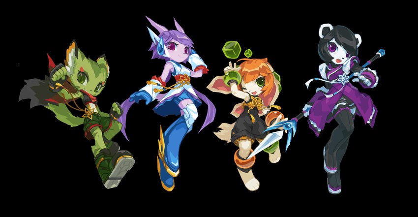
From left to right: Carol Tea the Wildcat, Sash Lilac the Water Dragon, Milla Basset the Hound, and Neera Li the Panda. For the box art featuring these characters, see: Freedom Planet 2 Box Art.
Note: Lilac, Carol and Milla are the playable characters from Freedom Planet 1. FP1 was originally a Sonic the Hedgehog fan game. Before the game was transformed into an original IP, it used early versions of the main 3 girls, their original creator was Ziyo Ling.
The Freedom Planet franchise has a strong Chinese influence on its visual design, so I gave the characters Chinese style costumes. I also streamlined the style to go with the game’s modern time period and sci-fi setting.
Getting in Touch with GalaxyTrail
I played Freedom Planet 1 in 2015, and I really liked it. I drew a series of alternative concept arts for the main girls (only 1 of each is shown here), and they were well-received by the game’s community. The developer GalaxyTrail noticed my version of the girls, and they used them to make a few display boards in video game conventions, among other goods. I think that was the moment we got in touch with each other.
As Art Consultant of Freedom Planet 2
Freedom Planet 2’s development started in 2014, I wasn’t part of the team from the beginning. When the first batch of concept arts for the game were created, the main creator Sabrina contacted me for possible suggestions.
Above are the early character sprites Sabrina sent me at the time. Sprites are low resolution in-game pixel arts. They are supposed to be animated, so the player can control the character to perform all sorts of actions.
I had no idea at the time that I would later become Freedom Planet 2’s character designer. I positioned myself as a consultant, and tried to keep the original color blocks as much as possible. My idea was to make them look more appealing, and more belonged to the Chinese inspired setting, by adjusting only the details.
Solving the 3/4 Front View Tilting Problem
Most side-scrolling games tend to draw their characters in a dead-lateral view. To make the characters look more appealing, we decided to use a 3/4 front view instead. This approach, however, has a pitfall — even when both eyes were at the same height and size, the further eye would look larger; even when both shoulders were at the same height, the closer shoulder would look droopy. A lot of games were plagued by this issue to different degrees. This problem is less obvious at smaller pixel sizes, but very pronounced at Freedom Planet 2’s character size.
You can clearly see this effect in the early 2015 sprites. The characters look as if their heads were tilted, and they were raising one of their eyebrows. Their standing postures also look droopy and weird.
My theory is that the brain expects perspective shortening when an object is facing the viewer with an angle. In normal life, the further side of an angled object looks smaller, while the nearer side looks larger. To compensate the perceived size difference, the brain adds weight to the further side, so we perceive both sides to be “of the same size”. But when it comes to pixel art, things are often aligned perfectly. The brain over-compensated the further side, making it appears to be larger, so the object feels “tilted” as a result.
Note: I didn’t look at any other game for reference when I was working on Freedom Planet 2. The examples above were collected in 2024 when I was expanding this post in 2024.
Mega Man X (the blue character) used a near side-view approach. By not drawing the other half of his face, the tilting problem was avoided. This is a typical approach of many games from the same genre. However, the X1 – X3 sprites didn’t take the legs into consideration. X’s closer knee looks lower, and the closer leg as a whole looks kinda weird. The X4 – X6 sprites solved this issue by enlarging the closer leg significantly. Mega Man 7 used the 3/4 front view approach, but they didn’t handle it very well. The franchise never used 3/4 front view in later games.
Shantae (the purple hair character) used a typical 3/4 front view approach. The one on the left is a sprite from Shantae and the Pirate’s Curse. Because the game used small sprite sizes, the artist likely could not reduce the further eye’s vertical size. They instead expanded Shantae’s closer eye horizontally, overlapped her head tuft with her eyelashes, obscured her further shoulder with her body, lowered her further hand by 1px, etc. The tilting was reduced significantly as a result, and I guess Shantae’s hairstyle might have a purpose in countering the tilting problem from the beginning. The middle and right ones are my attempts on a Freedom Planet 2 style Shantae, just for fun.
When comparing Milla’s first and final sprites side-by-side, the tilting on the first draft gets really obvious.
To prevent this from happening in Freedom Planet 2’s character sprites, I used the following visual tricks when needed:
Lower the further eye by 1px. All body joints were adjusted likewise.
Make the further eye 1px smaller than the nearer eye, both vertically and horizontally.
Dim the reflection of the further eye by 1/4.
This achieved a pseudo 2-point perspective effect within the limited pixel size, and the final sprites look more natural as a result.
As Character Designer of Freedom Planet 2
Freedom Planet 2 only had 3 playable characters at the beginning. Neera the Panda was an unfriendly character from the previous game. The main creator Sabrina liked the new sprite I did for Neera very much, so she decided to make her playable as well. Soon after I worked on the first sprites, Sabrina assigned me as the character designer of Freedom Planet 2.
Freedom Planet 2 is a pixel art game. To make sure the characters look proper in game, I always design their in-game sprites first, and turn them into HD arts later (if necessary). This was complete opposite to how art design works in normal game development. I think I was able to do this because Krita, the art application I used, allowed me to do quick adjustments on pixel arts. This reduced my workload significantly, which I really needed. At the time I was in the middle of my low period as an artist (2012 – 2022), I could not draw good HD art reliably. I felt more confident when drawing pixel arts. So that might also be a reason for me do use this approach.
As I became more and more experienced in pixel art, the sprites of the main characters also received overhauls. Lilac’s sprite animation project started earlier than other girls, so I could not change her sprite design too much. Milla, on the other hand, received a nearly complete redraw with extra details backported from her HD arts.
From Character Designer to Whatever Designer
The Freedom Planet 2 team was skeletal and loosely organized, consisted of remote-working freelancers. We were always all hands on deck, everybody does whatever they could.
Although I was nominally the character designer, I actually designed all kinds of stuff for the game. I ended up designing the visuals for over 100 characters, a lot of the enemies, almost all bosses, all hub towns, all overworld maps, many stage background elements, various small items, and even some UI elements.
Note: animations and extra shadings are done by other team members. I only provided designs for the base frame(s).
Working as a Volunteer
I worked on Freedom Planet 2 as a volunteer, and it was purely my own decision.
I have a day job, so I could only work on the game in my off time. I had zero prior experience on game development. My art skill was shaky at the time, and I had severe self-doubt. All matters combined, I worried my involvement might have a detrimental effect on the game. And because I have a stable income and didn’t need the extra money, I offered to work for free, so the money can be used to hire more people.
As a long time volunteer on the free and open source software scene, contributing my skills for free is just part of my everyday life. I also have no problem helping friends to finish a passon project. If nothing else, I see this experience as part of my spiritual journey.
HD Arts Version 1
In late 2015, the first version of the new character sprites are ready. I then created some HD arts based on the sprites. We had ideas of assigning elemental powers to the main characters, which is reflected in the picture above.
As mention before, 2012 – 2022 was my low period as an artist. But 2015 was probably when I hit the rock bottom. The team was also inexperienced, as they wanted the HD arts to have exactly the same colors, proportions and details as the pixel art version, and they didn’t want any eyebrows. These requirements would later be proved to be unsuitable for the type of art I was creating.
I intensely disliked the outcome of the Version 1 HD arts. They were the manifestation of every bad art trait that I tried to avoid in later years. I still see the above pictures as the lowest point of my career, and I rather not show them to others without context.
On the bright side, I learned from them what I don’t want in my art. So it was a valuable lesson, nontheless.
HD Arts Version 2
And because I disliked the Version 1 HD arts so much, I immediately began to experiment with different art styles, searching for a better solution. Finally in the middle of 2016, I created the Version 2 HD arts for the main characters.
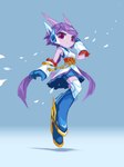
I wanted Lilac to look elegant and graceful. She is highly aerial and the fastest of the main four. I adjusted her horns, headgears, shoe decorations to make her look speedy and nimble. Maybe because of the shapes and colors of her armguards, gloves and long boots, she reminds me of Mega Man X.
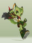
I wanted Carol to look rebellious and naughty. Her design is largely unchanged from Freedom Planet 1. I added reds all over her costume to correspond to her red scarf.
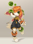
I wanted Milla to look cute and sporty. Her alternating odd color bracelets and the green pieces on her long ears are too iconic to be changed. But they are also too distracting, pulling viewer’s attention away from her face. I gave her a yellow crop top with a flower knot to draw attention back to the center. I also gave her a black romper to contrast with the yellows. The blacks also helped to supress her other flashy colors, making her design look more stable.
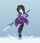
I honestly doubt Neera being a panda — she doesn’t have black fur around her eyes, and her ears are white. She looks like this since Freedom Planet 1. I treated her as a polar bear here — it makes sense because she uses ice magic, too. Her colors are mostly unchanged from FP1, but her white fur now has a cooler shade. Purples details were added everywhere to correspond to her purple dress. Her pose looks too similar to Lilac’s, so I redrew a new pose later when I was creating the pixel art version.
Pixel Arts Final
The pixel arts above were based on the Version 2 HD arts. They were used on the game’s character select screen. The pixel art version were created one year later in 2017, the colors, contrast, facial structures and body blocking received many improvements. I consider this to be the definitive version of the main girls.
Overworld Map Character Sprites
In 2020, I decided to hand-paint the game’s overworld maps. I also designed new character sprites to run over the maps. Although these sprites are much smaller than the stage sprites, they actually look more appealing despite the high-angle orthogonal view being more difficult to draw. The characters have more personality, and their body blocks are well-defined. My pixel art skill had come a long way, and I regained much control of my art in general at this point. These sprites are my personal favorite.
Conslusion
I didn't prepared to work on a video game project like Freedom Planet 2. I was offer a chance to make use of my art skill, so I went with it. Unfortunately, the 7 years of the game's long development span (2014 - 2022) overlapped with my low period as an artist (2012 - 2022). Bad things happened one after another in those years which really stressed me out. On top of that, I had to draw things I was unfamiliar with, all the time.
Suffice to say, I had a very difficult time in those years, both mentally and creatively. But the challenges pushed me to go through a mental transformation, and it also pushed me to improve my art skills. I think it was a meaninful life experiece. I changed for the better as a result, and I’m thankful for that.
Original/中文原文
自由星球 2 主角设计高清图定稿 (第 2 版)
自由星球 2 主角设计详解
本文是我参加开发的独立动作冒险游戏——“自由星球 2 (Freedom Planet 2)”的 4 位可操作角色的设计和过程介绍。
上图角色从左到右分别为:野猫可萝 (Carol Tea)、水龙雷凌 (Sash Lilac)、猎犬美兰 (Milla Basset) 和熊猫凝露 (Neera Li)。关于使用这些人物设计绘制的封面图,请见:自由星球 2 封面图。
注意:Lilac、Carol、Milla 三人是来自自由星球 1 代的可操作角色。自由星球 1 代原本是一个基于刺猬索尼克的二次创作游戏,在改为原创项目之前,游戏的三位主角的早期版本的原作者是 Ziyo Ling。
自由星球的世界观是以中式风格为主导的,因此我以中式服装为基础设计了主角们的服装。但因为作品的定位是当代加科幻,所以也进行了一些风格化的处理。本文将按照时间顺序先后介绍不同时期的不同的设计方案。
与 GalaxyTrail 结缘
我在 2015 年的时候玩过前作自由星球 1。因为我非常喜欢这个游戏,所以就用自己的风格为游戏的三位主角画了一套改良版的概念设计图 (原图内容非常多,此处仅节选主设计图各一张)。这套图在自由星球的玩家社区中很受喜爱,也被开发组 GalaxyTrail 拿去做成了宣传展板,我想他们就是这样认识我的吧?
作为自由星球 2 的美术顾问
自由星球 2 的开发大概在 2014 年就开始了,项目最初的人物设计师并不是我。自由星球 2 的前期概念设计有了初稿之后,游戏的主创 Sabrina 联系了我,想让我作为顾问提供一些修改建议。
上图是 Sabrina 当时发给我的四位主角的精灵图。精灵图 (sprites) 指的是游戏中使用的低分辨率动态像素画,玩家就是操作这样的像素画角色在场景中移动和做出各种动作的。
我当时并不知道他们后来会把我换上去作为角色设计师。我本着让开发组不需要进行太多改动的想法,尽可能保留了原始设计的配色、发型等大方面,试图通过只调整细节来让角色看起来更中式、更讨喜一些。
上图是由我进行重新设计后的关卡精灵图接近定稿的状态。我最初改完发回去给 Sabrina 的版本应该比这个简单一些,但整体上应该差别不大。不过因为没有彻底推倒重来,自由星球 2 中几位主角的造型设计是有所妥协的。如果当时我选择了推倒重来,说不定会设计出完全不同的配色、发型和服装结构。
解决像素画的 3/4 正面透视歪斜错觉
大部分横向卷轴动作游戏都倾向于侧面绘制人物。自由星球系列为了人物更好看而选择了 3/4 正面的角度。然而我发现在像素画下面这个角度存在一个陷阱——尽管左右眼画得一样大,远侧的那只眼睛却会显得特别大;尽管左右肩膀是对齐的,近侧的肩膀却会显得下垂,诸如此类。许多采用这种角度的游戏都不同程度的存在这个问题。
Sabrina 发过来的那张关卡精灵图初稿就是一个很明显的例子——明明像素是完全对齐的,角色的体态和眼神却总是给人一种歪歪扭扭的错觉。
我个人猜测这个现象是因为人脑会假定一个侧面摆放的物体存在近大远小。在观察者看来,一个斜着摆放的物体靠近观察者的一侧看起来大,远离观察者的一侧看起来小。大脑会自动增加远离观察者一侧的权重,告诉我们其实两边一样大。而像素画的元素往往是平行对齐的,如果画面物体的两侧一样大,大脑的这个补偿机制就会造成问题,显得远侧部分更大,于是在感受上会觉得东西“歪掉了”。
注意:我在设计自由星球 2 的人物时并未参考任何游戏,上图的例子是 2024 年扩写本文的时候才收集来的。
洛克人 X (蓝色人物) 的精灵图采用了更大角度的侧面,避免绘制远侧的那半边脸——我不画出来就不会歪了。这也是大部分同类游戏的典型处理手法。但 X1 – X3 的精灵图没有对 X 的小腿和脚板大小进行补偿,所以近侧的膝盖显得比远侧的低,整条腿看上去也有点怪。X4 – X6 的精灵图通过强调双腿的近大远小来解决了这个问题。在撰写本文时,我还发现洛克人 7 是采用 3/4 正面的,但处理的不是特别到位,后来他们干脆再也不用 3/4 正面了。
香缇 (紫发人物) 的精灵图采用了典型的 3/4 正面。左边一张是“香缇与海盗的诅咒”中的精灵图。由于这个游戏的精灵图分辨率较低,设计师可能无法缩减香缇远侧眼睛的垂直像素,于是转而采用近侧眼加宽 1 像素,头发轮廓重叠远侧眼睛的睫毛,用身体遮挡远侧肩膀,远侧手掌下降 1 像素的方式来应对。这也很大程度上减轻了头眼歪斜的错觉,我甚至觉得香缇的发型设计一开始就具备了应对这个问题的功能性。中间和右边的两张则是我按照自由星球 2 的精灵图风格绘制的香缇,画着玩的。
美兰的新旧两版精灵图放在一起时差别更是极为明显。
对于自由星球 2 中的精灵图设计,我通过双眼底部基线错开 1 像素、内侧眼睛宽高各减小 1 像素、内侧眼睛反光亮度降低 1/4 等手段在有限的像素大小内营造了两点透视的假像,全身其他关节点位也有类似的处理,从而使得角色看上去自然舒展。
作为自由星球 2 的人物设计师
自由星球 2 最初的可操作角色只有 1 代的 3 位主角:雷凌、可萝和美兰。熊猫凝露是前作的不友好角色,但因为项目主创 Sabrina 喜欢我调整后的精灵图,所以额外将她也作为 2 代的可操作角色了。在我修改了精灵图的设计之后不久,Sabrina 就决定让我来负责游戏的人物设计了。
由于自由星球 2 是一个像素画风格的游戏,为了避免人物设计在做成像素画时不好看,我在设计人物时都是先设计关卡精灵图,然后再根据它去绘制高清图。这跟传统的美术流程其实是相反的。我想这可能和我使用的数字绘画软件 Krita 本身的特性有关——它让我可以在像素画条件下进行灵活的概念设计,帮助我降低了我在美术设计环节的时间和精力开销。而且我当时正处在严重的创作低潮期 (2012 – 2022),高清图经常画得乱七八糟,直接画成像素图的话我对自己也更有信心一些。
随着我绘制像素画的经验逐渐累积,四位主角的关卡精灵图也经历了多次后期调整。其中雷凌的精灵图因为动画制作开始得最早,导致无法进行除了简单换色以外的大幅改动。美兰的精灵图改动最大,她的最终版精灵图相比起初版几乎是完全重画的。一部分高清图中的额外细节也被我设法反向移植回去了她的精灵图中。
从人物设计师变成整体美术设计师
虽然名义上我是人物设计师,但因为人手不足,其实我贡献的设计覆盖了游戏中的方方面面。我设计了一百多位人物、大量敌人、几乎全部的 BOSS、全部城镇背景、全部大地图、相当数量的关卡背景元素和许多道具。到了最后索性连游戏的封面图也亲自上阵画完了。由于小型独立游戏开发的组织比较松散,团队中的许多成员都是能干什么就干什么,不存在明显的职位、分工什么的。
注意:游戏中的人物动画、后期处理等是由开发团队中的其他人完成的,我只是绘制了每个角色的基准设计。
我是纯粹是基于兴趣参与这件事的。我担心我缺乏经验,能力不足,业余兼职时间不可控等因素叠加起来会为开发带来负面影响,还有在个人创作低潮期的一些心理因素在作怪,所以就主动提出不收取任何报酬。这个决定也包含了让开发组把省出来的经费拿去多雇佣多几个帮手的想法。
作为一个自由开源软件运动的长期志愿者,免费贡献自己的技术本身就是我生活的一部分。我也不觉得帮助志同道合的朋友完成一个项目有什么问题。把这段经历当作生命中的一段修行也未尝不可。
高清图第 1 版
主角们的关卡精灵图在 2015 年底定稿了第 1 版,然后我就基于它们绘制了第 1 版的高清图。当时我们有过为每个角色分配自然属性的想法,所以上图中也尝试表现了角色们的属性。
我在 2012 至 2022 年间的创作状态很差,加上开发组当时可能因为没有经验,非常执着于高清图的颜色、比例、细节必须与精灵图高度一致,还有不能有眉毛之类的微操要求,导致最终画出来的效果非常生硬。
我个人非常不喜欢这一版的高清图和同期创作的一些其他的概念图。它们几乎汇聚了我日后将竭尽全力回避的一切令人生厌的特性,以至于我一直把上图视作自己创作生涯的最低点。
不过往好了说,这套图也让我了解到自己最不想要的风格是怎样的,所以它们也是有宝贵价值的。
高清图第 2 版
因为我对第 1 版的效果很不满意,我随后开始了一系列针对性的练习,尝试了各种手法来演绎 4 人的高清图以摸索适合的设计和画风,直到 2016 年中才终于把高清图的设计定了下来。
水龙雷凌的设计要点是仙侠和飘逸。她在游戏中有很强的空中性能,奔跑速度也最快,所以我通过调整龙角、头饰、鞋子装饰、飘带等的造型来表现她的速度感。可能是因为护腕、手套、长靴的设计,让我觉得她的造型有点像洛克人 X。
野猫可萝的设计要点是叛逆和调皮。她的造型基本沿袭了 1 代,但在全身各处增加了红色的细节以呼应她的红领巾。
猎犬美兰的设计要点是可爱而运动。她的一些来自 1 代时的标志性设计元素:手环脚环左右错位异色、耳朵上的装饰块等不能更改,但是我认为它们过于零碎,容易造成观众的注意力被分散。在 2 代的设计中我让她穿上一件带有胸部绳结的黄色的短上衣,试图将观众的注意力重新吸引到上半身中心,并用黑色连体服加强颜色对比,增加视觉稳定性。
熊猫凝露其实名不副实——她从 1 代开始造型就没有黑眼圈,耳朵也是白的,又使用冰系招数,所以这一次我是直接把她当作北极熊来设计的。她的服装结构基本承袭了原始的配色,但在细节上增加了紫色在各处的呼应。凝露这一版动作我觉得跟雷凌的有点雷同,后来在绘制像素画版本时我根据她的个性重新设计了动作。
像素画定稿
上图的这些像素画版本是基于第二套高清图重画的,用于游戏中的角色选择画面。因为绘制时间在 2017 年中,比高清图晚了差不多一年,在用色、对比、脸部、体块概括等环节能看出改善的迹象。我认为这一版本应该被视作主角们的真正的定稿设计。
大地图精灵图
我在 2020 年底决定要以全手绘方式重新制作游戏的大地图,为了增强大地图的表现力,又配套设计了四个主角在地图上的精灵图。虽然这些精灵图的像素分辨率很小,而且还是相对不好处理的高视角正交视图,但它们的表现力却比关卡精灵图更好,尤其是体块的概括明确有力,角色个性鲜明,反映出我的像素画技巧和形体控制能力的进步。我个人特别喜欢这套精灵图。
个人总结
我是在毫无准备的情况下,出于因缘巧合被半推半就地卷入到自由星球 2 的开发中去的。游戏长达 7 年的开发周期 (2014 - 2022) 与我个人的创作低潮期 (2012 - 2022) 重叠,这段时间里又接连发生了许多事情,使得整个过程中我的心理和创作状态都非常糟糕。因为人手不足,我还得硬着头皮去绘制大量自己以前从未尝试过的东西。
尽管一路走来非常艰难,但这些挑战促使我完成了心态上的转变,也在很大程度上提高了我的绘画技巧。没有这一次低谷中的坚持,就不会有后来走出低谷的我,所以我觉得这是一段非常有意义的经历。

There are no comments.
Login to respond »